Traffic Summary
The first widget on the mitigation status tab is Traffic Summary. This summary is a chart section which can be configured to display multiple types of traffic graphs.
Basic Controls
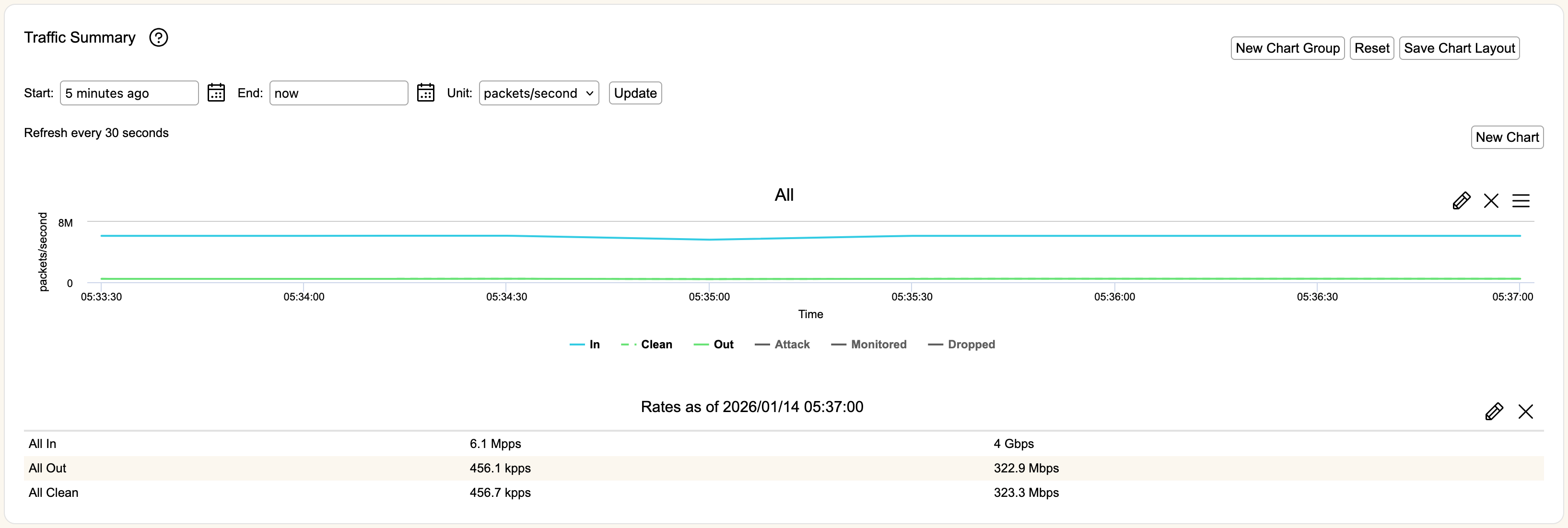
By default, you will see a Line chart of All In, All Out, and All Cleaned traffic for the past five minutes, along with a Text chart for current traffic rates in packets per second and bits per second. Save Chart Layout will change the default to your currently open set of charts. Hitting Reset will bring it back to this default set of charts, preserving any new times you've entered.
New Chart Group will create a separate section of charts that can be set to a different time period, to allow comparison of data from two different times.
Start and End are the times used to create the charts in that group. You can use the icon to select a specific date and time, or you can write an entry in the format "X year/month/week/day/hour/minute ago", or use "now" to indicate current time. You can use the mouse to click and drag on the chart to zoom in to sections of the chart without having to set a new time period. Click Reset Zoom to bring it back to the original settings.
Unit is used to set the unit of measure for the charts. You can choose between packets per second (pps), bits per second (bps), or average bits per packet.
Update will refresh the graphs if you have changed the Start, End or Unit settings. Graphs, by default, will refresh themselves based on the time period displayed and the number of ticks. The refresh time of the graph displayed will be listed above the graph area.
The four icons shown on a chart allow you to Edit (pencil icon), Maximize (window icon), Delete (cross icon), or Export (three bar icon) that chart. When using Export, you can immediately print the chart or export it to a variety of graphics formats. Maximize and Export are not used for Text charts.
New Chart will create a new chart under the group it was used in. There are three types of charts: Line, Percent, and Text.
Traffic Categories
Line and Percent charts will allow you to sub-select different categories of traffic to view. These categories are:
- In- All traffic coming into the Zone.
- Out- All traffic that is being passed on to destinations within the Zone.
- Attack- All traffic that is considered malicious attack traffic.
- Clean- All traffic that is considered clean traffic.
- Monitored- All traffic that is being flagged by mitigation measures in monitor mode.
- Dropped- All traffic that is being dropped by filter devices and not forwarded.
Line Charts
You can create a new chart or edit an existing one so that is displayed as a Line chart.
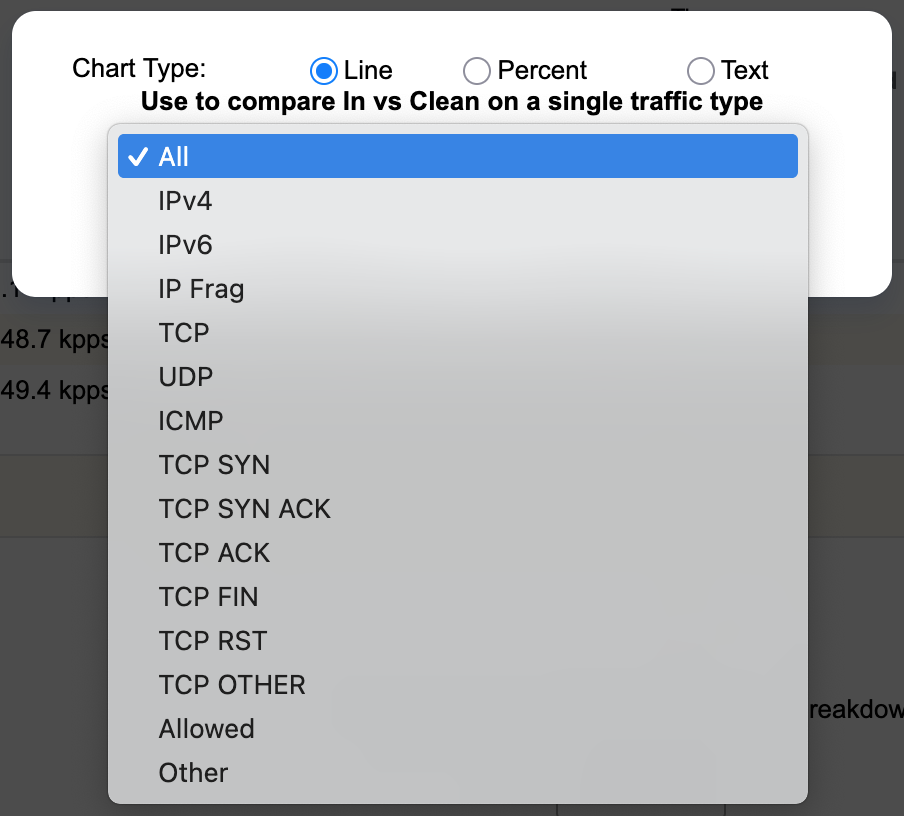
Line charts allow you to select the type of traffic to be displayed. The possible selections are shown in the dropdown menu. Hit Create Chart to create or edit the chart or Cancel to remove the popup. Clicking on the different labels in a Line chart will toggle whether that category is displayed or hidden on the graph.
Percent Charts
You can create a new chart or edit an existing one so that is displayed as a Percent chart.
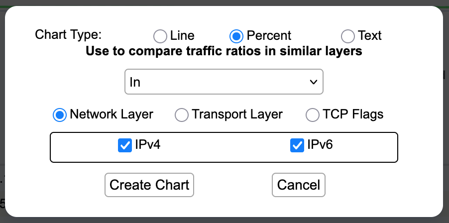
Percent charts lets you select different layers of traffic and select protocols to be displayed as a total percent of that layer of traffic. You can view this for all traffic In, Clean traffic going out, or **Attack **traffic coming in.
You can view Network Layer traffic, Transport Layer traffic, or examine TCP traffic by TCP Flags. Under your selected layer, use the checkboxes to identify the protocols or flags you are interested in. When examining TCP Flags, TCP Other represents TCP traffic that does not have any of the other applicable flags.
Hit Create Chart to create or edit the chart or Cancel to remove the popup. When displayed, clicking the different labels in a Percent chart will toggle whether that category is displayed or hidden on the graph.
Text Charts
You can create a new chart or edit an existing one so that is displayed as a Text chart.
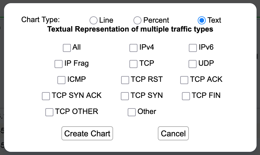
Text charts are the simplest charts that will show you data rates in packets per second and bits per second for each of the selected protocols. The top of the Text chart will have a "Rates as of" display with the date and time for the displayed traffic rates.
Hit Create Chart to create or edit the chart or Cancel to remove the popup.